Team
Product Design: Lee Jones, Abby Mills
Content Design: Emily Shields, Misti Pinter
User Research: Denise Sauertig
People go to Google searches and other methods outside of Meta to understand and address their privacy concerns. This can lead users to unrepeatable sites to get information about their problems. Privacy Center is a situation-based solution that allows users to learn and manage their privacy across the Meta family of apps.
Product Design: Lee Jones, Abby Mills
Content Design: Emily Shields, Misti Pinter
User Research: Denise Sauertig
Before 2022, Meta lacked a cohesive story around its privacy practices. People interacted with privacy through isolated touchpoints including consent moments, policies, and settings, each scoped to individual products. This fragmented approach made it difficult for users to understand their rights, often pushing them to rely on external sources like articles and blog posts to piece together how to control their own experience.
Meta’s privacy controls and privacy story are fragmented. There is a lack of a place to learn about the privacy concerns someone may have and how to address them.
These five concerns became the foundation of our design direction and shaped the initial topics the Privacy Center would cover.
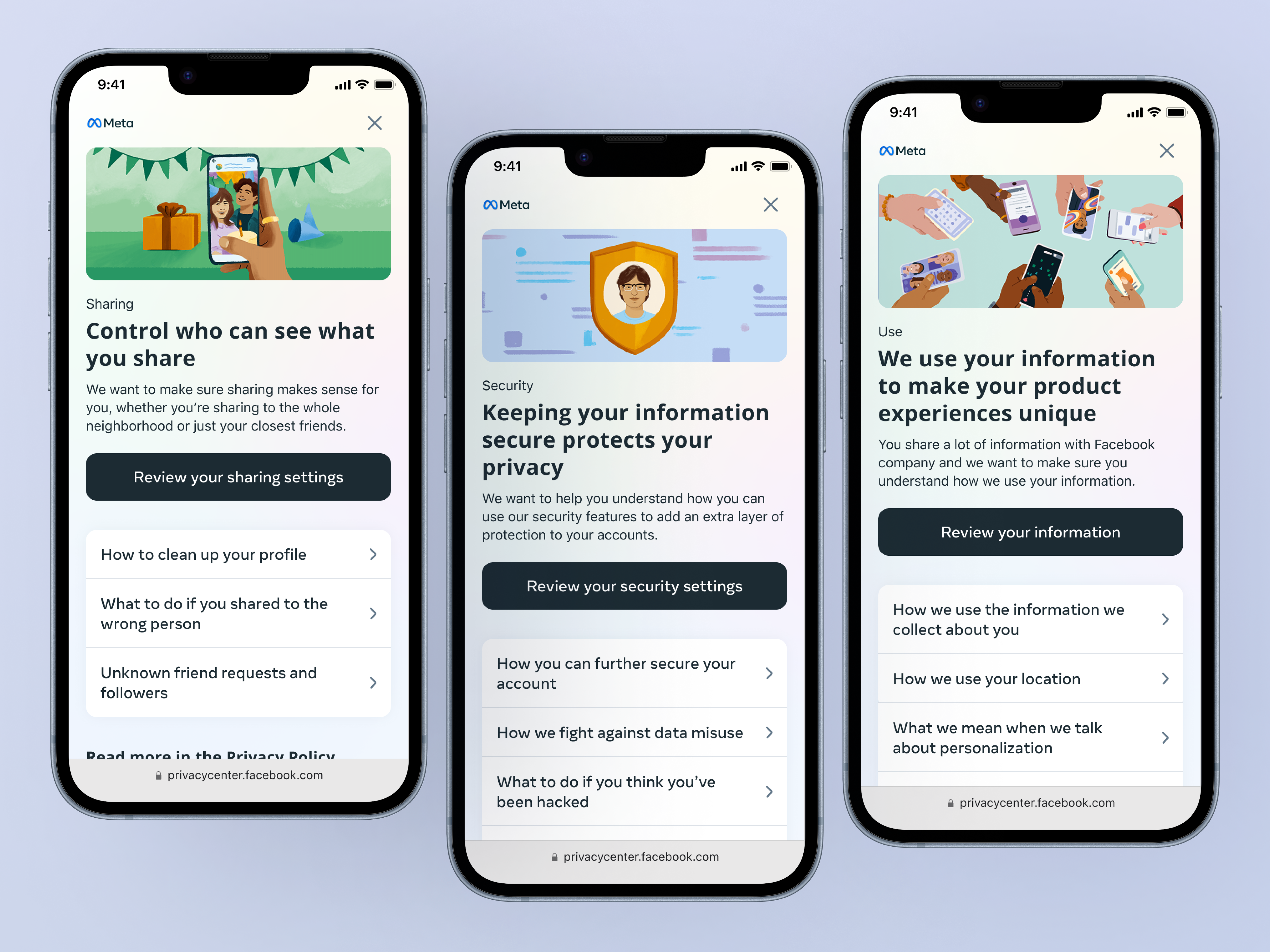
5 core privacy concerns emerged from this research:
How to keep accounts secure
“My account was hacked. What can I do?”
Who can see what is shared
“I’m unsure who can actually see my content.”
What information does Meta collect
“Is Meta listening to my conversations?”
How Meta uses your information
“How is my information used by the app?”
What determines the ads shown
“I’m freaked out by a creepy ad I saw, and I don’t know what to do.”
User Goal: Quickly, understand a privacy concept, understand if it relates to me and know what actions I have to solve it.
Business Goal: Educate people on their privacy options and make it easier for them to understand how our practices affect them. So that they feel comfortable and empowered using Meta’s products. To reduce the prevalence and severity of tangible people problems people were reporting to us, and to increase people’s trust in Meta.
Privacy Center’s core users for the initial scope were low-technical literacy users of the Facebook, Instagram, and Messenger apps. Technical literacy is defined as an individual’s ability to independently and effectively use technology tools to access, manage, integrate, evaluate, create and communicate information. Technological literacy prepares individuals to make well-informed choices in their role as consumers.
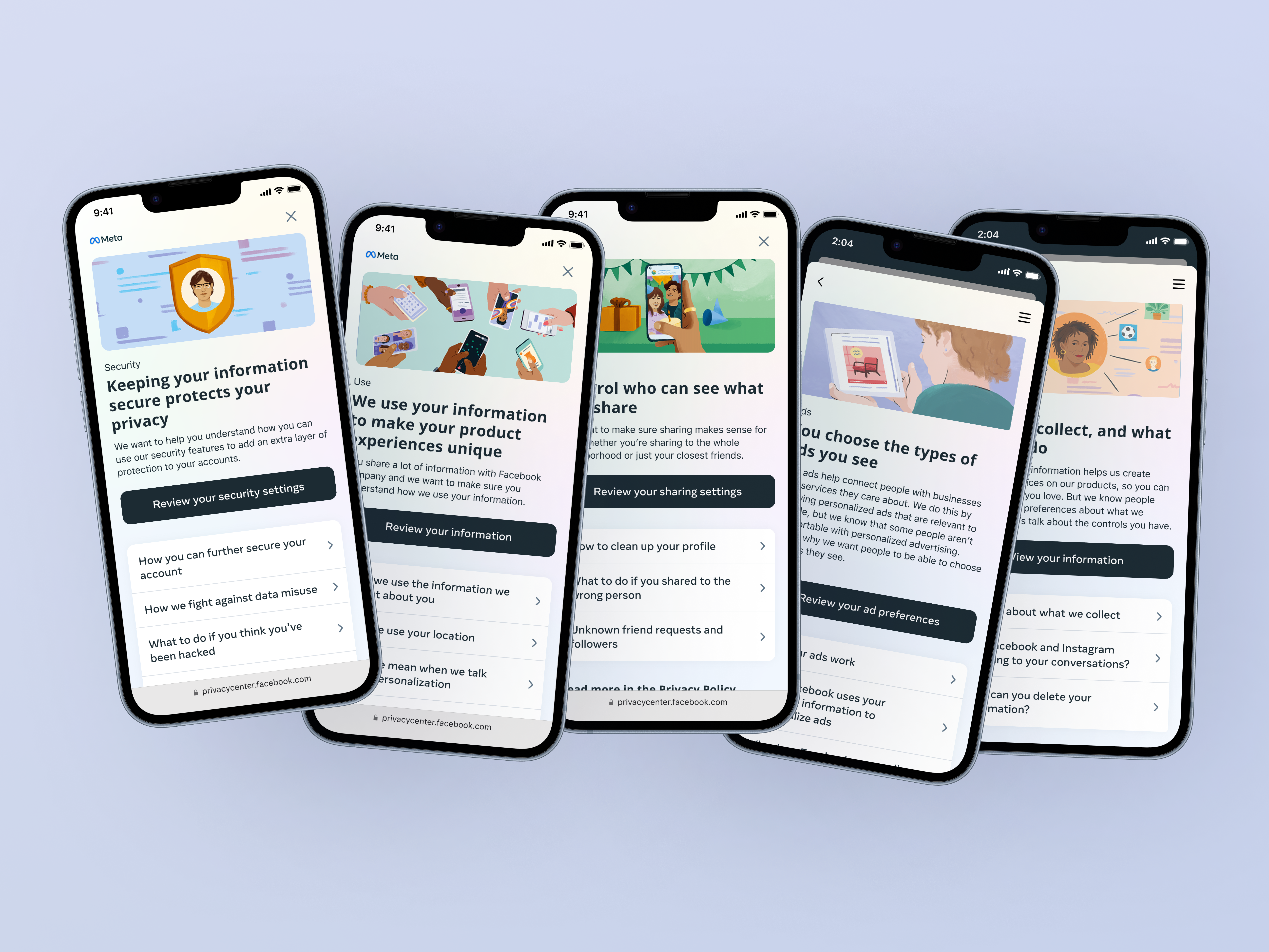
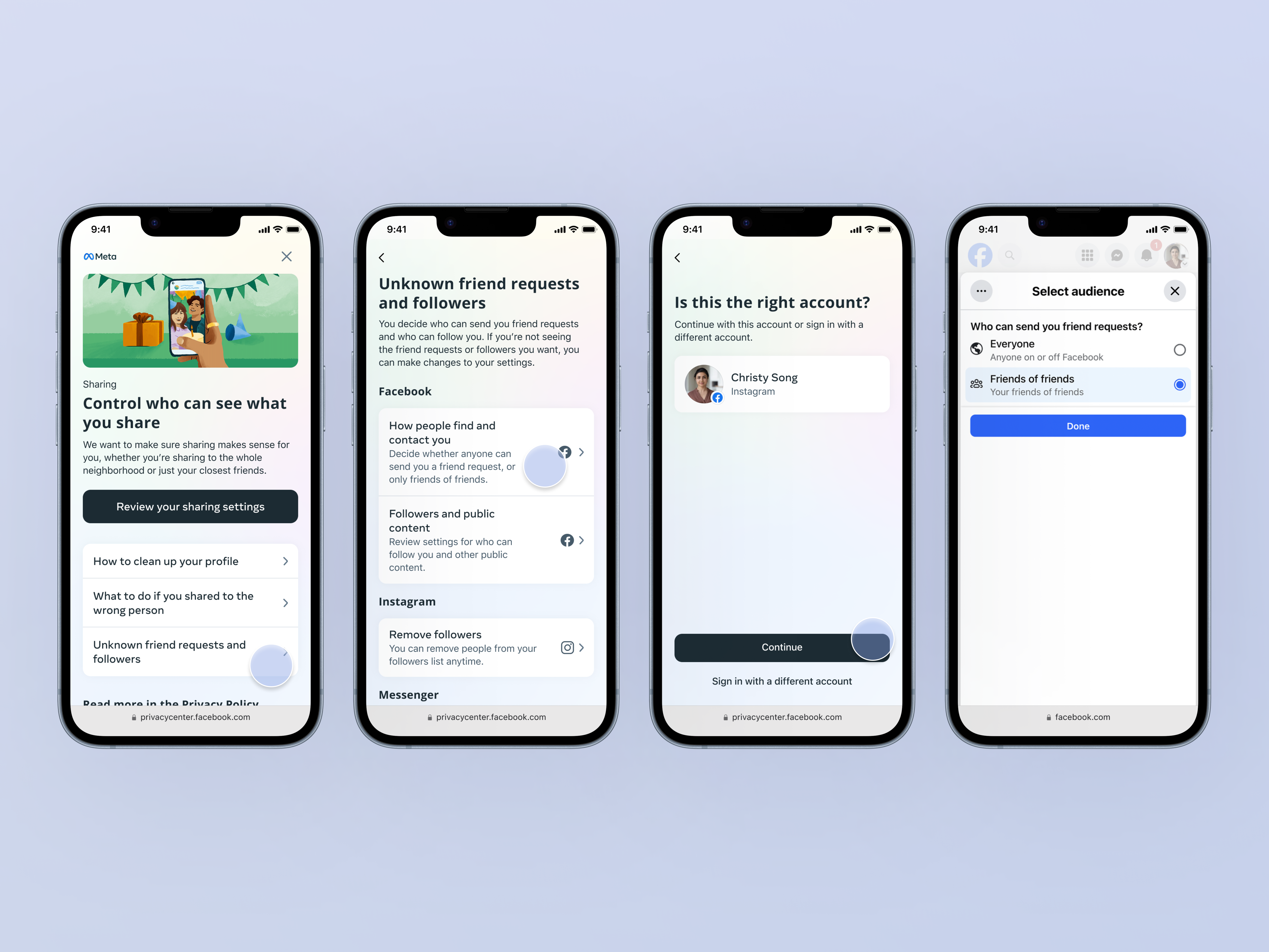
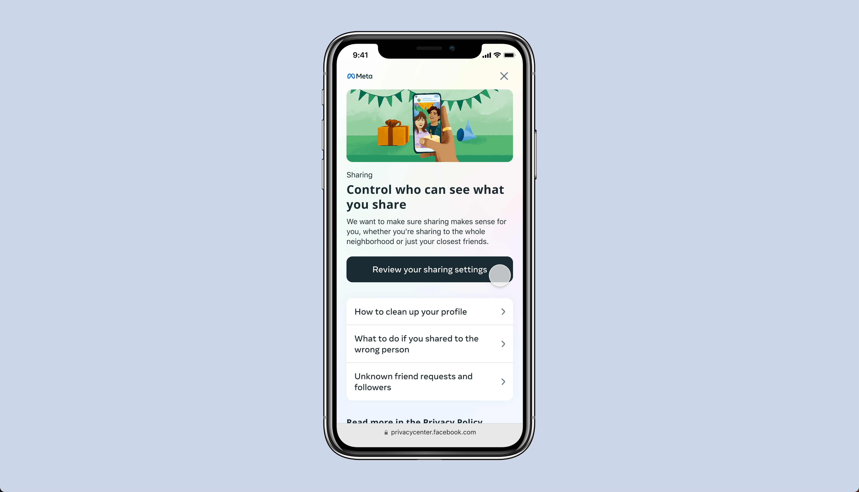
Keep the page structure simple “Concerns” are problems or challenges research has found are shared across platform by people. When people have a privacy “concern”, people need to be able to locate the solution as quickly as possible.
In the design, we structured the page with 3 key points:
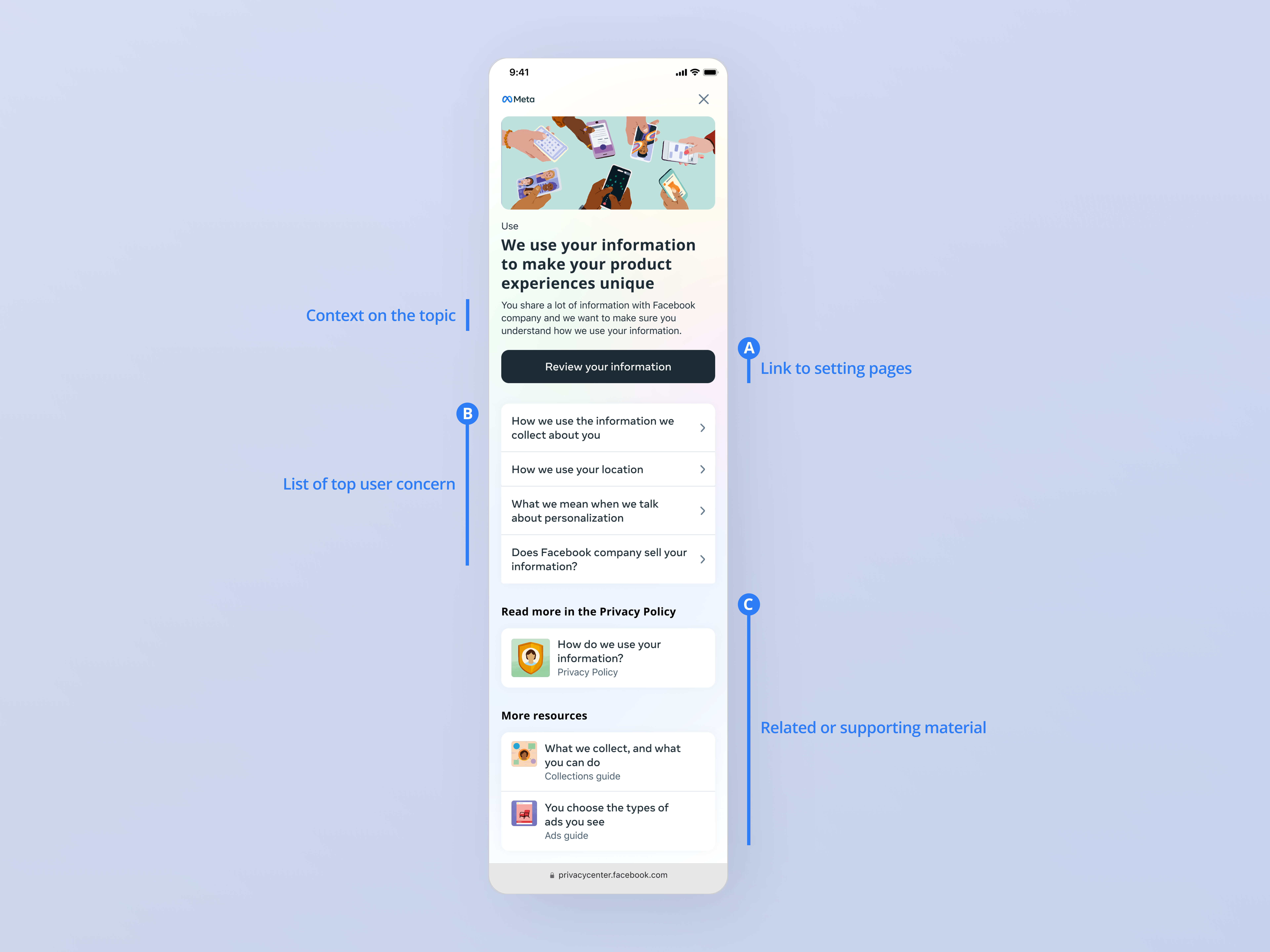
The final approach balanced task completion with learning, helping users see how the information related to their situation and what to do next. Since people come to our platforms to connect with others, not to study privacy, simplifying the structure made it easier to find what they needed and move on with their day. Content mattered just as much as layout — a clear, well-crafted sentence or header set people up for success and signaled exactly where a click would lead. Because this surface spans multiple products, that clarity was essential for guiding people to the right profile on the correct app. "Meeting people where they are" meant designing around their existing understanding of Meta's Family of Apps rather than introducing new mental models, and writing in plain language anyone could follow regardless of technical background. From a design standpoint, that meant clearly defining what the Family of Apps meant in a privacy context and showing how concerns could be identified and resolved within each specific app.
Our research partners developed a set of heuristic evaluation criteria, a usability method that identifies real interface problems so they can be addressed through iterative design. These criteria were distilled from actual user research into a list of scenarios reflecting genuine pain points.
Testers were given a high-fidelity prototype along with these scenarios and asked to navigate the experience to understand could they complete the given task. After completing they were given a survey to rate their experience. The results were then benchmarked against the same survey administered on the previous design to determine if their was discernible change.
We developed a scalable design system that has been used by other teams to educate users on specific concepts and provide access to the tools they need to solve their problems. Such as the “Teens” guide, which provides privacy-related education and tools for people under 18 years of age.
Since its launch, Privacy Center has seen success in helping people solve their privacy concerns quickly.
Simplicity is powerful. Questions and gaps will surface during the iteration process, so stepping back to realign around the core problem keeps you focused.
Know what you're solving for. Without a clear core problem, it's hard to have conviction in your design. Clarity on goals tells you what to act on and what to set aside.
Never underestimate a great content designer. Not every problem needs a UX or UI fix; a single, clear sentence can do as much as any design pattern.